Layout
Deprecated: Creation of dynamic property PPDStack::$accum is deprecated in /var/www/principiadiscordia.com/cramulus/includes/parser/Preprocessor_DOM.php on line 753
From Cramulus
Contents
- 1 1st Draft of Etc. Discordia
- 2 2nd Draft of Etc. Discordia
- 2.1 Cram's Notes 7/22
- 2.2 Net - re: Cram's Notes 7/22
- 2.3 Moar Cram Thoughts
- 2.4 Net - re: Moar Cram
- 2.5 Cram sez
- 2.6 Net - re: Cram sez
- 2.7 000's very late response
- 2.8 Net - re: 000's very late spaggotry
- 2.9 Feedback from Syn
- 2.10 Net - re: Syn Feedback
- 2.11 Briefly from Cram
- 2.12 Syn replying to Cram
- 2.13 Net - re: Briefly from Cram
- 3 3rd Draft of Et Cetera Discordia
- 4 4th Draft of Et Cetera Discordia
- 5 5th Draft of Et Cetera Discordia
- 6 6th Draft of Et Cetera Discordia
- 7 Part I of III of the 7th Draft of Et Cetera Discordia
1st Draft of Etc. Discordia
Let me know what you think of the image quality if you print it out. Also note the printer model, or at least the kind of printer it is — copier, laser, inkjet...
- I'll make a printout of it tomorrow at university, i'll let you know about the model.000 07:24, 16 July 2008 (UTC)
Anything I'm missing?
000, I tried incorporating the ampersand element, but it didn't look right... If you could supply a sketch or a detailed description as to how you were imagining it, then I'll play with it some more. Have you been able to find a CS version of InDesign yet?
- I'll get it ASAP (that is, before thursday evening Amsterdam time, which is the first moment i'll have real time to play with this). my basic idea was just to take the ampersand glyph, make it light grey and place it behind the "Et" in the title. maybe make it real large or something, even half falling off the page. i dunno. i'll play with it.000 07:24, 16 July 2008 (UTC)
I left out a few images that just didn't translate to black and white, but if you're particularly attached to one that's not there, I can give it another whirl.
Also, I haven't incorporated the quotes to be sprinkled throughout, and have been scheming a much busier layout that I'll show you in a few days.
Feedback from 000
- IT LOOKS AWESOME SLICK AS HELL (the frontpage) 000 09:29, 16 July 2008 (UTC)
- Isn't the front page supposed to be in colour? 000 09:29, 16 July 2008 (UTC)
- you forgot the subtitle, "Et Cetera Discordia -- The Party at Limbo Peak". i was thinking, maybe just below the image ... except that ... the crossroads landscape is flat as a pancake LOL :) so that may not make a lot of sense hehehe. or does it perhaps make just enough nonsense to be funny? 000 09:29, 16 July 2008 (UTC)
- Actually, seeing this take form and the general style (the slanted round boxes really give me a sort of 50s feel about it, kind of fitting to the "Bob" imagery) kind of make me want to redo the drawing for the front image, i could also place the crossroads on top of a hill/mountain of course (which wouldnt make sense from a logistic point of view, but does as a metaphor) 000 09:29, 16 July 2008 (UTC)
- I like the idea about including a teaser to entice latent-discordians to pick up and open the book. It should perhaps contain some specific keywords in the teaser. I know, in my pre-discordian days, I'd have opened any book mentioning "Chaos" on the cover, for instance. Maybe it should also mention that it's a collection of short writings? Because, knowing that it's not a long story, but a collection of short bits, would also make it more likely for me to randomly open te book and browse it a bit. 000 09:29, 16 July 2008 (UTC)
- page 12: the BIP card. if it's a card suggesting it might be cut out, maybe not in the slanted rounded box? (even though i really, really like those boxes, so might as well keep it). Further, I think the text [dunno if you made it?] but your life experience, your 'cell,' can be altered drastically is a littlebit creepy/recruiting sounding, like an "improve your life!" ad. either go that way and make it really over the top or tone it down. a bit. How about but your life experience, your 'cell,' might be larger than you think or but your life experience, your 'cell,' can be upgraded with an interstellar spaceport and hi-tech robot sex slaves. 000 09:29, 16 July 2008 (UTC)
- ok, judging from the overall look of the book, i repeat, i love the slanted rounded boxes, but if it's going to be just like this, it's nice and consistent and the weird images can carry the weirdness of the book, but i think it needs at least one more stylistic element to make it interesting. it's kind of overall the same right now. these elements would probably be: Zarathud and short bits/memebombs/marginalia. The marginalia will work nicely, but I'm not entirely sure as of how to fit Zarathud into this clean layout? 000 09:29, 16 July 2008 (UTC)
Net 7/17 re: 000
- THANKS. :D
- I don't know. I can work on a color version, but if someone else makes a cooler one, we could use that instead.
- Maybe you could work in a tubes and truck joke? Subtitle absence has been noted.
- Thanks. I encourage you to print it out for the full effect. Also, I'd be interested in seeing you develop the cover illustration.
- Looks like Cram has addressed this below... Yeah, people like to know what frame of mind to get in when approaching reading materials.
- Yes, I'll try a different frame style, maybe one with scissors and dotted lines. Good call. I didn't make it. We also don't need to include it, editorial discretion, etc, etc.
- I was thinking that if we do end up peppering the book with Zarathud vandalism, that the sketchy style he's drawn in, and the fact that he's messing things up would juxtapose well against a clean, consistent layout. I was thinking of adding some other graphic elements that would help reference the internet and create interest. Netaungrot 23:14, 17 July 2008 (UTC)
Feedback from Cramulus
some of my notes are specifically design/layout, but some are editorial. (I'll take care of those)
- First off, you're to be commended for the awesome job. It's really exciting to see this project come to life like this. It looks more tangible now than I had previously imagined. I hope you've been enjoying making this stuff as much as I have.
- Overall art style: When I saw it on my screen, I didn't quite get it. Now that I'm looking at a printout, it makes perfect sense. The slanted rounded boxes look (to me) like TV screens. This fits with our discussion about having the overall style be a sort of collage - reminiscent of the old PD in that it juxtaposes varying bits of media, but wiht a more modern feel. It reminds me of channel surfing late at night and seeing all this weird stuff. Perfect with the theme of the Strange Times.
- Fonts: I like the fonts. It may be due to low print quality, but in the copy in my hands they seem a bit thin. Could use a slightly bloder font. Overall however, it's very inviting and easy to read.
- Page Size - is this okay for lulu.com? I suspect that the two-pages per page layout we have going right now will confuse our printer.
- Cover: Add subtitle: "The Party at Limbo Peak". The "abstract" at the bottom below the byline, here are some suggestions:—"Explorations of chaos, stupidity, and infinity"—"New iterations of the Discordian fractal"—"Writings from the Discordian Cyberspace Masquerade"
- Inside: Leave room for a copyright page. Syn has generated a few more cover pages, one of which I think would fit well as an inner title page. (the Principia has a few, right?) Insert some room for a Kopyleft page (text to come), and an introduction page (text to come)
- Page 6: change to this image: http://www.mcs.csuhayward.edu/~malek/Surrealism/magritte2.jpg
- Page 9: Perfect placement for the "bob" & Hardy picture.
- Page 11: Introduction to the BIP... this seems very out of context as a second piece. I think the Bare Minimum BIP piece might actually serve as a better intro to the BIP, since the names and sequence of invention are kind of extraneous to the actual idea. Could we replace this piece with something lighter? Maybe the "TAZ has ugly, retarded cousin"? it's a little lighter :-P
- Page 13: Expland first occurances of BIP to "Black Iron Prison". Expand SSOOKN to "Super Secret Order Of Kabbalistic Navigators".
- Page 19: Replace references to America with something more vague. We're talking about Western Civilization.
- Page 21: We've got too much vexati0n / war / america stuff packed right at the beginning. If we ditch this piece, I wouldn't shed a tear. I'm in love with the graphic on page 23 though.
- Choose Your Own Adventure covers: need to photoshop out the author / illustrator names. Add in names of Discordian saints.
- Page 37 Delete Bird Jams. Replace with the piece Dream Jams.
- Page 43 Reminder to self: pick out original posters from POSTERGASM and make into graphics like this one.
- Page 53 Change title to "Divine Madness"
- Page 61 Change title to "Once Upon a Pickle Pickle..."
- Page 66 Remove piece - it's now a part of "Dream Jam".
- Also: The Parable of Steve is in there twice.
Wow, 66 pages and we've still got a lot of material to go.
Net 7/17 re: Cram
- Thanks dude. I couldn't have done it without all the work you guys already put into it. And yes, I have been getting a kick out of it.
- Huzzah!
- Please to note your printer model or kind of printer (laser or inkjet).
- I can export the file to PDF in a number of ways, such as "printer's spreads" where it's all interpolated for double sided printing. What you're looking at is a "reader spread."
- Check. How about "Short Writings and Art from the Discordian Cyberspace Masquerade"
- No problem. We probably should coordinate fonts when this gets a little more fleshed out.
- Ok.
- :D
- I think you're right. Smaller, lighter pieces first, longer pieces in the middle.
- Check.
- Check. CORRECTION! THIS IS NOT POSSIBLE DUE TO THIS LINE: "While we herald the bravery of our men and women in uniform at the many fronts in the War on Terror, we have effectively given our President and the Congress a blank check to spend from our reserves of domestic freedom at their discretion."
- Try "we have effectively given our Leaders a blank check..." - I mean, they a war on terror in the UK too, right? I'm not actually sure how they refer to this debacle. Eh, one or two American references aren't bad. As long as we don't go overboard I don't think it'll be a problem. Cramulus 13:09, 19 July 2008 (UTC)
- Yes, switch "President" for "Leaders" and it's fine, we got enough "War on Terror" going on in Europe as well, even if it's not called "War on Terror" explicitly.
- Yes. I'll ditch "Support the Troops" for now and reshuffle the image associated with it.
- Ok. Suggestions, pls?
- Check.
- ?
- Check.
- Check.
- Check.
- Lol, good catch. Netaungrot 23:13, 17 July 2008 (UTC)
2nd Draft of Etc. Discordia
I think we're coming into the home stretch ...
Page 19 needs some love. I still haven't worked in all the quotes we have planned and of course there is the title page, table of contents (and the bottom-of-the-page indexing), kopyleft and copyright page, intro, and adding some Discordian Saint names to the Choose UR pwn Adventures, but besides those I think it's almost there.
I have made changes in accordance to the critiques except as noted above. If you compare the text typeface weight, you'll notice it's a tiny bit thicker on this version, as per Cram's suggestion.
No issue is to minute to address at this stage, so if even the smallest thing is bugging you, please get it out into the open ASAP.
I love the FNORD HODGE and PODGE dingbats Syn and other's created. I'm going to massage at least one tube of it into the coarse hairs of the Etc. Discordia's white space.
Are we still all on board for Zarathud shenanigans? All I need is about a dozen ideas and I can start working them in. Note to self: (and anyone who procures InDesign CS in the near future) 1. Copy text. 2. Paste in new text box. 3. Create outlines 4. Change text body element to paper color. 5. Manipulate outlined text for profit !!!! Netaungrot 04:28, 20 July 2008 (UTC)
Cram's Notes 7/22
- Okay, Overall - looking good, still happy with all of this.
- Bold text still seems difficult to distinguish from regular text. This doesn't come up often, but see the Pickle Pickle Parable.
- There are a number of pieces which still aren't included. They include:
- Hearts & Minds
- the Shrapnel Theme stuff (recently updated by RWHN)
- Liber Fru Fru (let's just grab the internet bit which has been retyped)
- OMGASM description
- Stupid Content
- Finished Cutups (other than Dream Jam)
- Zen Koans
- Myspace Monkeys
- A lot of the Marginalia
- Could you make more of the marginalia look handwritten, or set at an odd angle? I'd love to see it look like it had been scribbled on, sort of like the PD. So far most of the marginalia has been set upside down, which is fine, but MOAR! Don't be afraid to break some style rules with the marginalia, it should look cutup, collage, out of place, extraneous. Like some kid got ahold of the book and wrote notes in the margins before it got sent to the printer.
Specific page commentary
- Front Cover: 000's piece is really colorful. I also think (and I may be wrong here), that we can get a color cover on this thing. If so, we should really blow up that image. And being the cover, let's ditch the computerized vertical-line effect thing on it.
- TOC: Magritte painting should accompany The Strange Times, not hte TOC. The TOC text needs to be updated into an actual Table of Contents. Instead of the Magritte, let's put in one of the ads for the party, in the propaganda thread. Or even better: that sexy image that 000 shopped up which was the forum header image. (you know, the Mount Olympus Water Park one)
- Page 3 Needs byline "by Professor Cramulus"
- Page 5 What happened to the laurel & hardy "bob" pic?
- Page 6 I love the font for the CHAOS section. Can we get some more of the marginalia in that font? Looks like a typewriter.
- Page 11 I think we should ditch this piece. It's too bad, but it's not really relevant. I talked to RWHN about it, and he's cool with it.
- Page 14 Good pairing of image with text. This spread (p14-15) needs some text though, would be a good place for a koan or some more marginalia.
- Page 16 Being the first Cutup/Zarathud piece, we need some serious zarathud here. I wonder if there's a way to graphically demonstrate that he's taken two pieces and cut them up? 000?
- Page 19 Switch the image here (whatever it ends up being) with the image on page 16. I'll dig around some more for some wacky MS Paint collage
- Page 20 Either the quote or the credit should be in ital. Not sure which matches our style better.
- Page 22 Good pairing of image and text
- Page 23 Needs a pic of Enrico. Try this one: http://homepage.ntlworld.com/porlstephenson/News/Gaddafi_Tikaram.jpg or this one: http://www.coxandforkum.com/archives/CARI.Gaddafi.gif
- Page 24-25 This spread has very little text on it. Needs more marginalia, koan, whatever
- Page 31 needs attribution "By Professor Cramulus". Also: I've decided this piece works better with "O:MF" written as "Mindfuck". So it should be "Go Mindfuck Yourself" at the beginning and in the ending bit.
- Page 39 needs attribution "By Professor Cramulus"
- Page 43 ...It might be cute to draw a correlary between the Etc. Discordia and the PD. Being that this is the only game in the whole book, (which I find odd, personally) this might be a good place to do it. http://principiadiscordia.com/book/images/Sink.gif - that image is from the PD's game SINK... maybe add it here?
- Page 45 The weird text in the Channeled Messages "Y'H-SH'RP-E-DU-DUDU-DEDA-DADA" might work better in a different font.
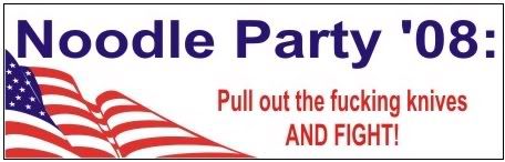
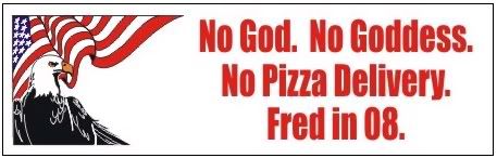
- Page 45 Change the noodle party bumper sticker to this one: http://img.photobucket.com/albums/v711/Marburger/Fred08knifefight.jpg ... these ones might also work elsewhere: http://img.photobucket.com/albums/v711/Marburger/fred08craps.jpg http://img.photobucket.com/albums/v711/Marburger/Fred08pizzadelivery.jpg
- Page 63 missing some italics. Should read "I do it for me. You're doing it like me." Also, the last line "Think For Yourself, Shmuck!" should be in italics.
- Page 64-65 Spread needs more images
- Page 66 Change "O:MF" to "Mindfuck"
Zarathud Ideas Here's some ideas for what Zarathud is doing as he makes his way through the book. Zarathud...
- Kicks a line, moving it out of alignment
- stands on a line, making it bow or sag in the middle
- has a rope or chain attached to a line, and is dragging it over his shoulder, pulling the paragraph into the margin
- has put tape over a word or two and has written in FNORD. Zarathud stands nearby, holding tape and a pen, admiring his work.
- is surfing on some marginalia
- is driving a crane, and has lifted a phrase right out of the text. The phrase is dangling at the end of the chain, above the paragraph.
- tears out a little part of a page and puts it on the opposite spread. (maybe you can see the page behind it through the "hole"
- has wrinkled up a page. Zarathud looks frustrated and stands at the footer with a lot of crumpled paper around him
- crosses out a byline and writes in "BY ZARATHUD" in childlike lettering
- has a firehat and firehose. The edges of the page appear to be badly burned.
- is rubbing his belly as if he's full. There's a big bite mark missing from the corner of the page.
- page 34-35 has several pictures of screaming people. Zarathud maybe should be holding his hands on his ears, as if he can actually hear the images screaming.
- somewhere I'd really love to see Zarathud putting up a poster on a tree. The pic on the posters is one of 000's nonsensical little doodles, or a portrait of Zarathud or something.
Net - re: Cram's Notes 7/22
Just a quick comment to say thanks for the excellent feedback, this very specific stuff is immensely helpful. I don't see anything I disagree with and will start making these changes today.
The one thing that may be an issue in technical terms is violating the margins on any of the pages besides the cover. This would prevent people from printing out the booklet by themselves since few printers can print very close to the edge of the paper. While this would be no problem for a commercial printer (who would most likely be cutting the pages from larger sheets) it would impinge on the DIY aspect. I like the ideas, and it seems like most of the ones in question can be adapted to fit within the margins.
— Net 76.115.0.95 19:52, 22 July 2008 (UTC)
Moar Cram Thoughts
We talked about putting the Saint's names on the Choose Your Own Adventure covers. The names are:
- Chaos - Patron Apostle Hung Mung
- Discord - Patron Apostle Dr. Van Van Mojo
- Confusion - Patron Apostle Sri Syadasti
- Bureaucracy - Patron Apostle Zarathud
- The Aftermath - Patron Apostle The Elder Malaclypse
Second: I realized that the correct name for day of the week is Prickle-Prickle, not Pickle-Pickle. Please update title. Mybad!
Third Let's use the Official Discordian Document Numbering system, like the PD uses. So the page numbers would be listed in five-digit format "00001, 00002, 00003," etc
Fourth I wonder if we can set the BIP card like this page is set: http://principiadiscordia.com/book/45.php ?
Fifth Other images from the PD which I like - use these if we run out of marginalia art
- http://principiadiscordia.com/book/images/ImmanentizeEschaton.gif
- http://principiadiscordia.com/book/images/5Pentagon.gif
- http://principiadiscordia.com/book/images/Squiggly.gif
- http://principiadiscordia.com/book/images/BavarianIlluminati.gif
- http://principiadiscordia.com/book/images/Tai.gif - this one should go on "Go Mindfuck Yourself"
- http://principiadiscordia.com/book/images/KallistiApple.gif
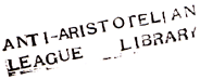
- http://principiadiscordia.com/book/images/AntiAristotelian.gif
- http://pics.livejournal.com/drjon/pic/0005qpzg - not from the PD, but it's sweet
Net - re: Moar Cram
Duly noted. Those images will definitely come in handy to break up the writings I overlooked. I also have a little bit of art I could add in there ...
I could use some clarification on the fourth point. Do you want me to make a new BIP card with a looser structure? Or something more nefarious?
I need to go make some dough tomorrow and Thursday so the soonest I can make another draft will probably be Friday night.
—Net 76.115.0.95 02:35, 23 July 2008 (UTC)
Cram sez
On the fourth point: I'm not sure, I was brainstorming. Talking about working the BIP card into a larger art piece... but I supsect that's more trouble than it's worth, and it may actually discourage people from cutting the damn thing out.
On art: I'm starting a collection of other art: Misc Art I'd say this stuff trumps the PD art. We have this "masquerade" theme which was very present at the party, but not present in the book - so spreading out some of the mask avatars into various places would be nice. Maybe even like as an author headshot, like they sometimes do in news or magazine articles.
I'm going to try my hand at making some more collage, too. I'll try to work in B&W. And if I can will myself to do it, I might write an intro today. More notes to come.
Net - re: Cram sez
Yeah, it would be nice to at least throw in a few masks as an afterthought than have none in there at all. Netaungrot 07:24, 16 August 2008 (UTC)
000's very late response
Yo dudes, sorry I'm checking in so late, as I was on vacation.
- front cover : personally, i kind of lean towards the subtitle "Explorations of chaos, stupidity, and infinity", which may be more seducing to a non-discordian audience to open the book than the Discordian Fractal one, even though that one is a pretty good line as well.
- I want to do a new version of the cover pic, one that's actually on top of a peak. Also not entirely happy with the relative lack of detail/finesse in the masked partygoers compared to the rest of the pic. I say that I want, but my current todo-list is longer than ever, and filled with slightly more important RL tasks than this, but I'm going to try. I agree with doing it in colour.
- I also still owe you guys a mockup/sketch/concept of the ampersand/ligature idea for the big title, which could be made a littlebit more interesting (but not too much, as not to make the cover too busy)
- Sexy forum header image: I have a much higher resolution version of the shopped pic on my harddisk, it was scaled down for the forum header. Will upload.
- TOC : This is going to be made to look a bit better than an asterisked list of titles, I presume? Suggest putting the authors in a lighter font-weight than the titles themselves, perhaps a discordian bullet-point thingy from the Fnord TTF font?
- Can we put a picture that's actually funny and not LOLCATish (which I promise, will be old and stale within a year even if it the last act of memetic warfare I will ever participate in, so help me Goddess) instead of the "so sleepy from all the farting" one? I can rummage through my files, I think I made a selection of funny pics with Paul a couple of weeks ago, partly saved PD stuff and generic WOMPesque/shopped material I forgot to upload to the vault.
- Generic typesetting remark: From looking at the first piece (Strange Times) and all the others, my eyes being a bit tired just gotten back from holiday, the text looks ever so slightly cramped, is there any possibility we can increase the word-spacing just a tiny littlebit?
- Page 11 : Dunno if there's any trick you can do about it, but having the title on two lines looks a bit odd, here. Unless we ditch the piece, as Cram suggested.
- Page 18 CYOA : Love this one. Any possibility of perhaps shopping in Hairacles's avatar into the cover pic? It might fit.
- Page 21 : Love the image inset, and the particular image.
- Page 22 : What is that pic? Did a discordian draw it? Style comes off as somewhat familiar...
- Page 23 : Agree about the pic of Enrico. I'd go for the first, shiny dictator instead of the caricature. Another good idea might be to ask Hoopla if he still got one lying around.
- Page 23: Yes. It's important we get some of that Russian there, great way to remember that crazy trollish pre-party chaos!
- Page 27: Can it get a subtitle like "How the BIP got to be" or "History of the birth of the BIP" or "So this bunch of monkeys walk into a black iron bar ... the Discordian ducks."
- Page 66: LOVE IT!! (but agree on s/O:MF/Mindfuck)
- what's up with the dudes with condoms over their eyes btw?
- good Zarathud ideas, will try to draw.
- DIY aspect: will people really print this off for themselves? i would guess they'd either buy the book from Lulu or read the PDF from screen? otherwise might it be possible to make a "light" version for home printing? Just a few quick hacks to make it work?
Net - re: 000's very late spaggotry
My responses in italics.
1. front cover : personally, i kind of lean towards the subtitle "Explorations of chaos, stupidity, and infinity", which may be more seducing to a non-discordian audience to open the book than the Discordian Fractal one, even though that one is a pretty good line as well.Ok. I tend to agree, it's a more descriptive while the discordian fractal is more of a fun idea but doesn't tell you very much about the book.
2. I want to do a new version of the cover pic, one that's actually on top of a peak. Also not entirely happy with the relative lack of detail/finesse in the masked partygoers compared to the rest of the pic. I say that I want, but my current todo-list is longer than ever, and filled with slightly more important RL tasks than this, but I'm going to try. I agree with doing it in colour.
Next version will be in color.
3. I also still owe you guys a mockup/sketch/concept of the ampersand/ligature idea for the big title, which could be made a littlebit more interesting (but not too much, as not to make the cover too busy)
I think it may be too obscure a reference. Most people don't even "see" the ampersand and just think "and." The reason I think it works on Syn's cover designs (00004 and 00005) is because all of the other stuff on the cover is totally unnecessary and fun, so why not throw in an unnecessary ampersand? That said, I worked into my cover design, which by the way, is more of a placeholder until something better comes along.
4. Sexy forum header image: I have a much higher resolution version of the shopped pic on my harddisk, it was scaled down for the forum header. Will upload.
To be used where?
5. TOC : This is going to be made to look a bit better than an asterisked list of titles, I presume? Suggest putting the authors in a lighter font-weight than the titles themselves, perhaps a discordian bullet-point thingy from the Fnord TTF font?
Yes, it hasn't been formatted because I don't know how much space I can get away with, since I don't have a final version of the TOC to play around with. Once we have a more finalized version I'll start working it over.
6. Can we put a picture that's actually funny and not LOLCATish (which I promise, will be old and stale within a year even if it the last act of memetic warfare I will ever participate in, so help me Goddess) instead of the "so sleepy from all the farting" one? I can rummage through my files, I think I made a selection of funny pics with Paul a couple of weeks ago, partly saved PD stuff and generic WOMPesque/shopped material I forgot to upload to the vault.
Yes. It should be the WOMPiest of the WOMP. When you find the one post it somewhere with the keyword "WOMPiest".
7. Generic typesetting remark: From looking at the first piece (Strange Times) and all the others, my eyes being a bit tired just gotten back from holiday, the text looks ever so slightly cramped, is there any possibility we can increase the word-spacing just a tiny littlebit?
You have to print this stuff out to get an accurate sense of it. Otherwise you can waste a lot of time reshuffling things that turned out to be a total non-issue once things were printed. I'm going to bring this to two of the most experienced and anal people I know about typography and see what they say. I think the wordspacing was fine but I changed it to Garamond since Syn also has a problem with the body text. This ought to resolve any lingering issues with it, except now it's a bit more common rather than being unusual.
8. Page 11 : Dunno if there's any trick you can do about it, but having the title on two lines looks a bit odd, here. Unless we ditch the piece, as Cram suggested.
I disagree—it's a common occurrence in collections/varying content publications. But I suppose it's a moot point if we do give it the boot.
9. Page 18 CYOA : Love this one. Any possibility of perhaps shopping in Hairacles's avatar into the cover pic? It might fit.
Sounds like something you could easily take care of. Here's a link to the original file: [1]
10. Page 21 : Love the image inset, and the particular image.
:D
11. Page 22 : What is that pic? Did a discordian draw it? Style comes off as somewhat familiar...
If you want to know who specifically did it, please to familiarize yourself with the list of submissions.
12. Page 23 : Agree about the pic of Enrico. I'd go for the first, shiny dictator instead of the caricature. Another good idea might be to ask Hoopla if he still got one lying around.
Hoopla can go fuck himself. If you want to talk to him about it go ahead. I'll add it if you procure it, but I'm having nothing directly to do with him.
13. Page 23: Yes. It's important we get some of that Russian there, great way to remember that crazy trollish pre-party chaos!
I came late. :(
14. Page 27: Can it get a subtitle like "How the BIP got to be" or "History of the birth of the BIP" or "So this bunch of monkeys walk into a black iron bar ... the Discordian ducks."
You have to talk to RWHN if you want to start adding stuff to his writing.
15. Page 66: LOVE IT!! (but agree on s/O:MF/Mindfuck)
I'm also playing around with some wacky typefaces, see.
16. what's up with the dudes with condoms over their eyes btw?
Is amusing. I was amused and will continue to be amused in the future.
17. good Zarathud ideas, will try to draw.
More hands = lighter work.
18. DIY aspect: will people really print this off for themselves? i would guess they'd either buy the book from Lulu or read the PDF from screen? otherwise might it be possible to make a "light" version for home printing? Just a few quick hacks to make it work?
I don't think any hacks are necessary. Indesign will automatically reshuffle the pages for printing and that same PDF file can just be downloaded by people for assembling. Netaungrot 07:35, 16 August 2008 (UTC)
Feedback from Syn
Net, this book is looking really, REALLY good! Well done!
My observations:
Text
I agree with Cram, the font is really nice, but looks a little light for Lulu book printing (this lesson comes to you courtesy of Syn's wasted $25 - doh!). Can you use a heavier variety of the same font, or test out a different main body font all together. Possibly keep the titles and headings in this font and just change the body? - Just a thought.
Images
I love the slanted/skewed boxes, but am not sure that degrading the image quality with the vertical stripe is a good idea, it may look to some like a shoddy layout/printing job. It comes out pretty weird on my printer (Konica-Minolta Magicolor 2550DN). Some images are fine, others have moir patterns and others have vertical interference lines. If we want people to print at home, should it not be as clear as possible? From experience a good, but not over exposed level of contrast is good for image printing with Lulu. There area number of images in the SynGen books that didn't come out too well; I felt it was because they were lacking in clarity and contrast originally.
Also, I never did get the condoms-over-eyes images, but the make me snort out loud every time I see them, so I suppose they are effective in some way. :)
Net - re: Syn Feedback
My responses in italics.
Net, this book is looking really, REALLY good! Well done! Thanks dude. That means a lot coming from you.
I agree with Cram, the font is really nice, but looks a little light for Lulu book printing (this lesson comes to you courtesy of Syn's wasted $25 - doh!). Can you use a heavier variety of the same font, or test out a different main body font all together. Possibly keep the titles and headings in this font and just change the body? - Just a thought.
As I mentioned to 000 and as you'll see in the next draft, I used Garamond (Premier Pro (:fap:)) so we'll guarantee perfect printing. I also have a raging hard on for th at incarnation of Garamond and it plays off the headers better. In case you'd like to know, the headers for this latest version are Fertigo and it's a free font. The section/page number font is Telegram HPLHS, and the ransom clipping font is Anonymous Clippings, all available for free.
I love the slanted/skewed boxes, but am not sure that degrading the image quality with the vertical stripe is a good idea, it may look to some like a shoddy layout/printing job. It comes out pretty weird on my printer (Konica-Minolta Magicolor 2550DN). Some images are fine, others have moir patterns and others have vertical interference lines. If we want people to print at home, should it not be as clear as possible? From experience a good, but not over exposed level of contrast is good for image printing with Lulu. There area number of images in the SynGen books that didn't come out too well; I felt it was because they were lacking in clarity and contrast originally.
Please let me know which images have interference lines and moire patterns. I processed the images like that for a few reasons: One - It helps unify them across the book which the rounded/skewed boxes can't do on their own IMO, Two - It's more obvious to the eye than the plethora of JPEG artifacts present in the images, but you know you're supposed to look "through" the vertical halftone screen even when they're very coarse. Three - So by degrading the image quality a bit more it should appear intentional and paradoxically become less apparent, if that makes any sense. I'm also going to show this to some teachers at my school and see what they think and how they have dealt with low res images that needed to be printed. I'm still open to suggestions as well. I think they need to be processed in some way so it looks intentional and are unified throughout the book. As it is now, the resolution varies from proper to way subpar. The inconsistency seems more distracting than the halftone element, IMO. That said, I'll kill my baby and just use the box element for the fourth draft.
Also, I never did get the condoms-over-eyes images, but the make me snort out loud every time I see them, so I suppose they are effective in some way. :)
Right? Netaungrot 08:12, 16 August 2008 (UTC)
Briefly from Cram
Net, if you have room, can you please add this? It's my favorite piece of poetry ever posted on PD. http://www.principiadiscordia.com/forum/index.php?topic=14545.msg461884#msg461884
The condoms over eyes thing was just a silly WOMP - there's no backstory or in-joke. I think it might have been a pun on the word "cockeyed".
I agree with Syn about the vertical distortion on the skewed boxes.
Hey Syn, do you know if we can get the cover printed in color? Or is that only for hardcover? I haven't really looked into this.
Syn replying to Cram
Hey Cram. Yeah, you can have the cover in full colour on any type of book. Did you find our what font the 3rd ampersand came from?
NM, I just vecced it. See the new cover proposals. ;)
Net - re: Briefly from Cram
I'll make sure the poetry is in the fourth draft. Also, I haven't yet changed the names on the CYOA images, so if somebody could do that and upload the files I'd appreciate it. Netaungrot 08:13, 16 August 2008 (UTC)
3rd Draft of Et Cetera Discordia
Hey, Syn, could you link to a high res version of cover #00005? I like that one the best. Maybe it could use a little more integration with the direction I've been going but, definitely dig that one. Bleeds would be good too as well as a back cover. And, if you could give me the names of the fonts you're working with and whatnot, I may be able to integrate them with the rest of the book.
Netaungrot 09:04, 16 August 2008 (UTC)
Hi, Net.
I'm still not sure I agree about patterning the images, especially those that are meant to be copied and redistributed, although, having said that I do understand that digital artefacts are a serious printing issue, but - he says, pulling out a copy of Metaclysmia Discordia - it would seem that jpg artefacts are not a major concern for the printing process. I know a lot of those images were really crap quality, but the jpg artefacts just do not show.
As an aside, it may be worth setting up a Photobucket account for the book and mentioning in the book that there are higher quality versions available online at hxxp://www.wherever.com/etcdiscordia. Hell we could even put together an Et Cetera Discordia Propaganda Pack with all the good stuff and host that somewhere relatively permanent (POEE? ;)).
Fonts Used in the cover are:
- Century Gothic - Book Titles/'Provisionally Approved...' stamp upper left
- 4990810 - 'DO NOT STAMP' stamp bottom right
- Times New Roman (width reduced by 10%) - 'DS' in 'DS ARCHIVES'/'YOLD 3174' stamp upper middle
- Times New Roman - '(Provisional)' under title
- Typewriter-Regular - Discordian Services (Not a perfect match for the rest of the test so have replaced the whole thing in the latest posted version #6) bottom middle
The rest are part of the original SIMPLE SABOTAGE FIELD MANUAL Strategic Services (Provisional) cover, or pasted images.
The background layer - Mostly the original cover - was full of artefacts that were rendered sufficiently clean for printing with a few Photoshop filters. I have a printed copy of the SIMPLE SABOTAGE FIELD MANUAL printed by Lulu with that cleaned cover in front of me that attests to this, so please don't worry about remaining artefacts in the Et Cetera Discordia image. You won't see them in the print.
HTH! Rev. St. Syn, KSC 11:30, 16 August 2008 (UTC)
Latest Cover: Version 6 (png) FULL RES Can you give me a cover size with bleeds and a res? - Just saw the size on the covers page. Net, are you aware that isn't a size that Lulu print? http://www.lulu.com/us/help/paperback_printspecs The closest appears to be: A5 14.817 x 20.99 cm or 5.833 x 8.264" --Rev. St. Syn, KSC 18:07, 16 August 2008 (UTC)
I wish you were involved earlier, lol.
I've already said I'll swap out the vertically screened images for mere grayscales for the fourth version. It's time consuming but easy enough. I'm probably too close to the idea to see how my logic fails, but I trust your judgment as well as Cram's so, it will be changed. I assure you. What do you think about thickening up the rounded/skewed frames to about a 2 pt black line? Comments on the Garamond/Fertigo/Telegram combination? Can you dig the dingbat/clip art treatments?
Also, it's not too difficult to create another file where the document size is say, 6 x 9 inches (which is a lulu proportion) as well as an A5 version so people can download it and print it on their own. Good catch, but I've adapted publications to new page sizes and it's not my favorite thing to do in the world, but it can be done in a fairly short span of time. I'm going to keep working within the folded US letter size until everything is gleaming with doneness whereupon I'll transfer it to the lulu and A5 (finished, A4 flat) proportions. So if you could make the cover fit all of the above it would be most awesome, double awesome if you do the entire wrap around cover.
Thanks for all the details and prompt feedback. Highly appreciated.
Netaungrot 19:06, 16 August 2008 (UTC)
Net, the fonts are very nice. I'll bow to your superior font-knowledge. It looks so frikkin' pro right now. I have to say the dings really set it off, the moar the bettar as far as I'm concerned (but not too much ;))! I think thickening up the frames is probably a good idea.
I'm happy to do a full wraparound, glad you liked the cover! :D Are you guys sold on the colour? I left it the same blue as the original file. I have begun editing the next version of the cover. I'm working on removing the old page background, leaving the original stamps/printing/scribbles/notes, etc to make re-sizing easier.
So, A4 wrap, Letter Wrap and whatever lulu size is decided upon... I'll do a front and a back with a separate spine, once we get to the lulu stage, then combine it when needed.
--Rev. St. Syn, KSC 19:57, 16 August 2008 (UTC)
A few questions for Cram/000:
- Do we have a back cover blurb?
- Is this going to be published through Lulu with an ISBN?
- Have I asked those questions before?
- Which Lulu format/size are we going for?
--Rev. St. Syn, KSC 19:57, 16 August 2008 (UTC)
4th Draft of Et Cetera Discordia
Please be patient with the download, I went nuts with dingbats so the file is exceptionally GYNORMOUS. I could have compressed the file size, but this way, you can proof any page you need to and it will be full quality. I will manually reduce excessive dingbats when we start finalizing the book, so bear with me. If the download is too excessive for your connection/computer I can post a lower quality version, just let me know.
I'm glad you dig the typography Syn, which again means a LOT coming from you. (Still impressed by everything graphic design I've seen you do.) Also testing the idea of more dingbats being better - I like the texture.
Still haven't replaced names for Choose Your Own Adventure pieces, Table of Contents will need to be formatted and Wompiest of the Womp/Intro image needs to be placed. Also, Enrico pic, Miscellaneous Comments, Copyright page, Kopyleft page, Intro piece, Title page and back cover needs to be completed. I also have not thickened up the frames. I could be missing something here, so put your editor cap on.
Besides those things, let me know what you think. I tried to appropriate Syn's cover style via deconstruction through symbolism. All vertical halftones have been replaced with grayscale and I've started smoking fucking cigarettes again, fuck! I'm dating an extremely hot girl who's into psychology like me but still have feelings for my ex-wife, advice needed. Also, I need to learn how to dance, she's big on dancing.
Also, you guys are incredible, thanks for having me on board for this thing. We still have a ways to go, but I've been drinking and feeling appreciative see.
Netaungrot 08:46, 17 August 2008 (UTC)
5th Draft of Et Cetera Discordia
Still a monstrosity of a file and I presumptuously added Syn's cover I tweaked.
I think I'm officially obsessed with this project...
Choose Your Own Adventures have been changed, though I might have missed one.
Table of Contents has some shape, but the content is wildly inaccurate. When we're almost done I'll straighten her out.
Still need a bangin' intro image and intro piece, copyright/kopyleft pages, title page. Also, Cram, please doublecheck that all pieces are present, adding more is no problem.
I also gave some TLC to the dingbat textures. I can tone those down if they're bothersome. I also can tone them up a touch if some of them don't print well. And speaking of not printing well, try printing page 55, it's most likely to produce postscript errors. I'm going to go back and remove a lot of the dingbats that are coded into the PDF but hiding behind images even if everything prints out just fine. So expect problems printing samples, and know that I have a number of ways to fix it.
MAKING UP FOR LOST TIME, ITW.
Netaungrot 02:10, 18 August 2008 (UTC)
Cram's Notes
Man, you are making some killer progress. I've really been enjoying how this book has evolved over the drafts. It started off looking very clean and proper, and is finally descending into proper levels of chaos. I think the dingbats do a good job of feeling like extraneous clutter on the page while simultaneously enhancing the design.
- There are a number of pieces which still aren't included. They include:
- Hearts & Minds (by Cain)
- the Shrapnel Theme stuff
- Liber FruFru (let's just grab the internet bit which has been retyped)
- OMGASM_Description
- Stupid Content - actually, for effort's sake, let's just use The Book of Dewlap and not the form Cainad made.
- Finished Cutups (other than Dream Jam)
- that includes 5 Minutes of Panic, should be somewhere after Dream Jam, with Zarathud hacking it up.
- Street Time, should be late in the book, heavily hacked up by Zarathud
- The_Koan_Thread Zen Koans - throw these around liberally!
- Myspace Monkeys - on second thought, barely any of this needs to be in.
- A lot of the Marginalia - toss this around liberally!
Specific commentary on stuff:
- The Cover is looking sexier than ever. Should the subtitle be "New Iterations ON the Discordian fractal"? Or is "OF the discordian fractal" correct? will research.
- Table of Contents - I love the monkey siloheutte in front of the Magritte painting. The K ball and chain is sweet too. Some of the titles need fixed, I'll mention that on that pieces entry.
- Intro Page (00001) - I'll get on writing this. I'll see if I can WOMP up something in B&W, too.
- Page 00006: I can't find the original image used here on the left. I'd like to replace the word FAGGOTRY with SPAGGOTRY, even if it's just a larger SP typed on over the F.
- Page 00010-00011: There's some whitespace on 10 we could use for a koan or some marginalia. I was wondering... a lot of these pieces are two or four pages - is it better to have them on their own spread? That way you get the complete idea in one visual unit, without having to turn a page. As is now, it makes for a nice tear-out sheet though. What do you think? Is there a theory behind this layout?
- Page 12-13: I love the pairing of the gay wango tango image with the surveillance state piece.
- Page 14: There's a little ROFLBOT icon in the bottom right.
- Page 17: This is one of those Zarathud pieces. When will we get to see some of his antics incorporated?
- Page 18: Can you change the illustrator at the bottom of the CYOA image to "Illustrated by YUO"?.
- Page 20: The Dr. Strangelove quote needs "the atom bomb" at the end. Can you set the quote attribution on its own line? The hanging Dr looks weird.
- Page 21: It occurs to me that Princess Madnonymus has a pretty good avatar for an author headshot: http://we.dontexist.net/index.php?action=dlattach;attach=57;type=avatar - but please move the LANCELOT image somewhere else rather than removing it entirely, because I love it.
- Page 23: here's a pic for Enrico: http://i9.photobucket.com/albums/a95/discordman/bin/enrico.png
- Page 31: Title should be "Go Mindfuck Yourself". The second-to-last line of the piece should also read "Go Mindfuck Yourself". Plz adjust this in the TOC and the end page, too.
- Page 43: It's gonna fry some people's bacon that we're including some loveshade stuff, but they can cram it sideways for all I care.
- Page 47: Let's replace Freedom Isn't Free with another of the Vexati0n Materials, "Survival in the Surveillance State"
- Page 48: COYA book illustrator should be "Illustrated by the Wrath Of MS-Paint Cabal". If possible, can you boldface the W, O, M, and P?
- Page 70: I absolutely love the fonts, and how this is set. But delete the word "Operation".
- Random: Can we fit in any more of the Misc Art?
I really love this shit. I'm glad you're enjoying it too. I'm going to keep hacking at text. Is there anywhere you feel I should pay special attention to? Like maybe picking out the best marginalia or koans? I trust your judgement in picking stuff, but I could earmark some stuff too. I'd also like to get some more actual exchanges from the forum, I'm going to see if I can isolate any good snippets.
Cram
ADDED: 3-word-story, The Web of Chaos, Masquerade, Kopyleft page
WOW! This is just awesome, Net! I love the dingsplosions all over the place. I'd darken them slightly, but other than that I agree with Cram. Not liking the re-colourised cover (except that it's got those fantastic dings on it). Purely a personal thing, and I'm not going to make a fuss if everybody else likes it! :)
--Rev. St. Syn, KSC 16:19, 20 August 2008 (UTC)
"I'm dating an extremely hot girl who's into psychology like me but still have feelings for my ex-wife, advice needed."
Move forward my friend, move forward. She's your EX-wife for a reason. Get your booty moving and dance the pants off the psych-girl.
--Rev. St. Syn, KSC 16:24, 20 August 2008 (UTC)
THIS JUST IN: Edits:
Delete OMGASM Description. I didn't like it.
Replace with OMGASM Description 2 and OMGASM Description 3. SO SPEAKETH Cramulus 15:45, 21 August 2008 (UTC)
BTW: I passed along our fifth draft to RWHN and Hoopla to comment on it. I figured we could use an outside opinion or two before we concrete stuff. I'll also be doing some more editing on various pieces, I'll be sure to flag them so we have up-to-date copies in the manuscript.
Trip and I were talking about how this design is sexay enough that we don't want to waste it on just party materials. Also, Net suggested that it's quite easy to add more stuff to the book. So if you see anything else out there that you think belongs in, don't hesitate to plug us into it. this book has already outgrown its original britches. You guys have any thoughts on this? Cramulus 15:45, 21 August 2008 (UTC)
000
Yes, what Cram said. this design is so awesome, it would like totally be the PD2.0 we've been waiting for all these years. personally i think there's goldmines of swote to be found in the Or Kill Me subforum.
also, move on, she's your exwife for a reason. it'll be hard, but yeah. ah i know you'll be able to do it. let's chat in IRC about it some time.
about the vertical stripe rastering. well i still havent printed it, but i can totally understand the idea of using it to fudge up the JPEG artifacts, that is something i would do. but if Syn says it won't really show up in the print version, and it looks weird on the test prints, drop it.
also also also, fuck shit i read above i still have like 3 unfinished tasks i promised i would do for you guys that i havent done. there's beers in my head now but i'll write it in my todo book tomorrow.
also also * 4 im gonna meet Syn on saturday, so i guess that's brainstorming time? :D
and, did i mention it looks fecking swote? cause it does. im gonna have to write a more in-depth critique of specific parts when sober.
should we start a new page btw, or are we going to keep it long? 87.194.156.201 23:19, 21 August 2008 (UTC)
Net: 8-25
Sorry I haven't given you guys an update. I've been going crazy with this new girl - we'll be gone next weekend camping around the San Juan Islands. Cue dancing banana.
Which means that I'm going to be doing a lot of work on the book today through Thursday. I've been doing things here and there as I've had time but haven't gotten to a point to share the draft or properly respond to your feedback. Sometime in the next 12 hours I will and I'll address your comments and grievances as well.
Netaungrot 22:47, 25 August 2008 (UTC)
- Hey man, glad things are going well with the girl. Hey, are you going to be around on Columbus day weekend? I'll be in Portland for Esozone. We NEED to get together for a beers.
- I want to state, if I haven't yet, that you're doing a kickass job laying this shit down like pavement and I'm incredibly impressed. Is it cool that I'm still editing pieces and throwing shit on this pile? I don't want to get too carried away with adding new stuff, because I want this to be OVER soon so we can hold this sexy little thing in our arms and make love to it, but I am wracking my brains thinking - if this was the fucking final word on Discordia in this decade, what is it missing? This stuff exists out there, a lot of it has been posted on PD, I've just gotta track it down. And write an intro. And spike a fucking beer bottle on the ground and shout BIKAAAW. Cramulus 01:38, 26 August 2008 (UTC)
- I will be around on Columbus Day, a beer at the very least can be guaranteed. Also, Nigel wants to take you, me, and St. Mae to The Tunnel for great shenanigans. Have you heard that she might be in town when you are? I'm looking forward to it.
- Yes, keep heaping things in a pile and I'll transmogrify them into people riding dinosaurs with lasers ASAP.
- Also, fuck, missed my own deadline. I have to spend some time pruning off the fnord-dings in order to save time navigating the burgeoning file size. It's taxing my macbook. I've read over everyone's comments at least three times now and made a bunch of changes, but you'll have to take my word for it because I need to sleep and shower and do other banal rituals that are associated with being a Civilized Human™. Netaungrot 13:30, 26 August 2008 (UTC)
6th Draft of Et Cetera Discordia
Very sorry guys. My life rapidly went from quiet and predictable to a glorious insanity that I just couldn't turn down. So I hope you haven't completely lost interest and don't want to remove all of my genitalia.
I think we're getting pretty close to wrapping this thing up for a final critique.
  1. There are a number of pieces which still aren't included. They include:
             o that includes 5 Minutes of Panic, should be somewhere after Dream Jam, with Zarathud hacking it up.
SEE PAGE 16
* The_Koan_Thread Zen Koans - throw these around liberally!
I read this as a single narrative?
* Myspace Monkeys - on second thought, barely any of this needs to be in.
Please help me choose what goes in and whatnot. What would you like to see put in/left out?
* A lot of the Marginalia - toss this around liberally!
Still have more to work in, suggestions may help this go more smoothly.
* The Cover is looking sexier than ever. Should the subtitle be "New Iterations ON the Discordian fractal"? Or is "OF the discordian fractal" correct? will research.
I'm going to try some sans psychedelic cover variations at some point.
* Table of Contents - I love the monkey siloheutte in front of the Magritte painting. The K ball and chain is sweet too. Some of the titles need fixed, I'll mention that on that pieces entry.
Thanks. The ToC will be completed at the same time as the page index. It's the tape at the finish line, see.
* Page 00006: I can't find the original image used here on the left. I'd like to replace the word FAGGOTRY with SPAGGOTRY, even if it's just a larger SP typed on over the F.
Check.
* Page 00010-00011: There's some whitespace on 10 we could use for a koan or some marginalia. I was wondering... a lot of these pieces are two or four pages - is it better to have them on their own spread? That way you get the complete idea in one visual unit, without having to turn a page. As is now, it makes for a nice tear-out sheet though. What do you think? Is there a theory behind this layout?
It's just a book convention to have new pieces/chapters/sections always start on the right hand page. Not all books but a lot of 'em. The strict layout also is part of the idea that making the typography highly organized and consistent will help draw attention to Zarathud fucking with the orderliness. He will be worked into the layout as soon as the larger issue of all the content being accurate and present is settled.
* Page 12-13: I love the pairing of the gay wango tango image with the surveillance state piece.
Thanks, I thought you guys would like that.
* Page 14: There's a little ROFLBOT icon in the bottom right.
Fixed."
* Page 17: This is one of those Zarathud pieces. When will we get to see some of his antics incorporated?
After we get all the furniture moved in, the smaller but important accoutrements will be arranged. At least that seems to be the wisest way to go about it.
* Page 18: Can you change the illustrator at the bottom of the CYOA image to "Illustrated by YUO"?
Check.
* Page 20: The Dr. Strangelove quote needs "the atom bomb" at the end. Can you set the quote attribution on its own line? The hanging Dr looks weird.
Thanks. I think this quote might appear twice in the book too...
* Page 21: It occurs to me that Princess Madnonymus has a pretty good avatar for an author headshot: http://we.dontexist.net/index.php?action=dlattach;attach=57;type=avatar - but please move the LANCELOT image somewhere else rather than removing it entirely, because I love it.
Check. Although I don't think this reads as well when printed."
* Page 23: here's a pic for Enrico: http://i9.photobucket.com/albums/a95/discordman/bin/enrico.png
Check. That's a good one."
* Page 31: Title should be "Go Mindfuck Yourself". The second-to-last line of the piece should also read "Go Mindfuck Yourself". Plz adjust this in the TOC and the end page, too.
I'm going to keep the ToC scrappy and approximate until all the furniture is moved in and in a more permanent place. Otherwise, check.
* Page 43: It's gonna fry some people's bacon that we're including some loveshade stuff, but they can cram it sideways for all I care.
Well, I don't like Loveshade, but not enough to make a case to exclude him from the book. It seems that part of the whole point of the masquerade thing was to bring the discordian splinter groups together so naturally there will be elements I don't like but need to be represented to be true to the event.
* Page 47: Let's replace Freedom Isn't Free with another of the Vexati0n Materials, "Survival in the Surveillance State"
I think that was already in there, so I just took out Freedom Isn't Free.
* Page 48: COYA book illustrator should be "Illustrated by the Wrath Of MS-Paint Cabal". If possible, can you boldface the W, O, M, and P?
You must be referring to a different draft because page 48 doesn't have COYA on it.
* Page 70: I absolutely love the fonts, and how this is set. But delete the word "Operation".
Check.
* Random: Can we fit in any more of the Misc Art?
For sure.
I really love this shit. I'm glad you're enjoying it too. I'm going to keep hacking at text. Is there anywhere you feel I should pay special attention to? Like maybe picking out the best marginalia or koans? I trust your judgement in picking stuff, but I could earmark some stuff too. I'd also like to get some more actual exchanges from the forum, I'm going to see if I can isolate any good snippets.
I think I might be looking at the wrong koan page? Link please?
I could use some help sorting through the Myspace Monkeys morass in particular. I can work in snippets of all sizes as you prepare them.
  Delete OMGASM Description. I didn't like it.
  Replace with OMGASM Description 2 and OMGASM Description 3. SO SPEAKETH Cramulus
Okay. Did I do it right?
Netaungrot 01:31, 17 September 2008 (UTC)
Cram's Review
We're coming along quite well. I'd like to think that we're approaching the end. I get the sense that we're starting to lose steam, but I don't want to lose track of our goal. I'm almost done with the intro piece, and I think we've just gotta do a little bit more hacking, add Zarathud and final cuts, and we're good.
I've set up a Review page, and will be directing some people there to weigh in.
what follows is my commentary on the 6th draft. There's not a lot, because we're looking really good.
Page 3 - re-grab text for the The_Strange_Times, I picked out a few small typos.
Page 27 - re-grab text for Introduction_to_the_BIP, I edited a little. See my notes on that page.
Page 31 - change title to "Go Mindfuck Yourself". Center subtitle? Piece has been slightly edited (mostly for bold & italics), re-grab it from Go_OMF_Yourself. If there's room, insert the T'ai graphic linked at the end. (http://www.principiadiscordia.com/book/images/Tai.gif)
Page 37 - regrab text - minor typos fixed
Page 43 - add this graphic: http://img114.imageshack.us/img114/4600/ftshs5.jpg
Page 49 - Change title to "Bracing yourself for the OMGASM?"
Page 50 - last line, the protip at the end, fix the word "POSTERGASM" so it's all on the same line. We don't want people to tag their photos "poster-gasm"!
Page 53 - change title to "Tips for Launching..." rather than "Tips on Launching" (grammar).
Page 59 - change byline to "By Dirty Essence and Full Time Slacker, edited by Zarathud"
Page 61 - (and the whole myspace monkey suite) Put stamps, sillohuettes, and other visual garbage all over the place. It's cool if you can't read all the text. It should be in the background. This is the most chaotic bit of text, I also think it should be the most visually chaotic. Maybe Zarathud taking a dump on the page?
Page 67 - Delete Title "The Koan Thread", change it to "Traffic Koans". Replace text with the stuff here: The_Koan_Thread (recently edited). Spread out each story a bit so they don't seem like one continuous piece.
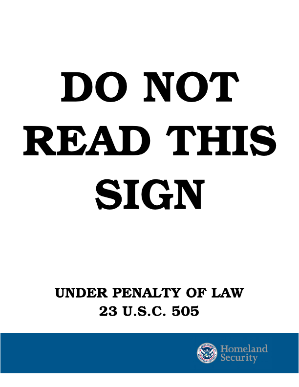
'Page 77 - Take the gibberish line ("y'h-sh'rpre...") and set it in a different font. Delete the Fred bumper sticker - it's too in-jokey. Replace with http://i9.photobucket.com/albums/a95/discordman/bin/bert.gif or http://i300.photobucket.com/albums/nn32/gundamagriculture/misc/do-not-read-this-sign-1.png , space depending. Maybe put the other one somewhere else.
Page 92 - delete the part of the graphic which says "Illustrated by Paul Granger"
Page 99 - scrub the byline on the comic. I don't want credit thar.
Misc: - I've scrubbed down the Marginalia. Please include this stuff in random places, in margins, whitespace, etc. Mix it up with the fonts.
Net - Re: Cram's Review
My comments are in bold or italics.
Some more notes... based on GA's reccomendations, I've done some significant editing. Please re-grab the text for the following pieces.
   * Strange Times
   * Bare Minimum BIP
   * Dream Jam
   * Shrapnel Project
   * Pipe Bombs
   * Thoughts on Shrapnel
   * OMGASM Description 2
   * The Great Pope Joan
   * Followup to Go Mindfuck Yourself
I'm no longer going to fine tune the typography until you guys have made up your minds about the content. I will be ignoring most critiques about body text formatting until the very end.
New Piecess: Discordians in History, Discordia2008. Note that for that last one, we might as well change all the occurances to 2008 to 2009, as that's when people will be actually reading this. ;-) You know, most graphic designers would make you sign a contract that limits the number of major revisions in layout and content you are allowed to make. If you guys had finalized the content before I was involved I wouldn't have wasted a good 20 to 30 hours of my life. Just saying...
Layout Notes: GA made some good points about some of the graphics, their repetition, etc. I don't agree with all of her comment, but here's the ones I most agreed with. Mainly it's images with IMPACT FONT macros. Not so fond of 'em. The problem is that we don't have a lot of replacement images... Maybe we can get 000 to doodle something? eh probably not. any thoughts? I don't think we're going to get anyone to doodle or otherwise create a significant amount of art for this book. I thought the idea was that were going to use whatever people submitted for the most part. I think the image macros should stay because they reflect a staple of discordian humor. It also accurately represents how internet-based the culture is. I can find some replacement images, but now that I'm back in school, this process is going to go even slower.
* Replace the Pic on p0005 with something weirded. Haven't figured out what yet. :-(
I don't want to. I like that one and I find it amusing. I don't think we should remove anything until we've found a replacement. Also see my previous comment about discordia being internet-based.
   * Replace the Sir Arthur Cone pic on p0007
   * Page 00014 - replace pic, but keep the Shadow/Graffiti line
   * Page 00015 - replace WOMP portrait.
Replace the above, with what?
* See GA's comments on page 00018 00019:
"00018 - 00019 - Have to say, I don't really like the double-page images. I think the PD did a good job mixing the images in with the text; in the Etc, most images get a whole page to themselves. I'd rather see smaller images with bits of text inserted crooked in the margins than have whole pages devoted to them. Having a simple image one facing page of the beginning or end of an article words as a kind of "bookend" for it, especially if the article has the feeling of starting or ending a section. On the specifics: I'd only put one (at most) CYOA cover in, predicated on being able to find a good resolution version. I do like the "Illustrated by Yuo" at the bottom of this one, though. One the poem: nice. I think you want "greyfaced beings" instead of "greyface beings" on the second line though. Certainly "Get" instead of "Gets" on the last line (compare "I get" to "I gets"). As a stylistic change, I'm all for replacing all the "-ed" endings with "-'d" (e.g., "greyface'd, cram'd, touch'd) for a more vintage feel. That's just me, and it might actually be more obnoxious that way. And why are all of the texty bits like this upside down? Go for some variety - have some just at 90 degree angles, or right-aligned, etc. Don't restrict your self to just right-side-up and up-side-down." Fuck that, this isn't the PD and the margins MUST be preserved for people to print this out at home. If you really want to argue this I'm going to clock you with some technical things that WILL happen to people as a result of trying too hard to think outside the box. When we finalize the content, Zarathud will be introducing more crooked elements. It's a figure/ground relationship: Zarathud's shenanigans are the figure, the orderly nature of the body text is the ground. Without this relationship, a lot of the impact will be lost. Also, the PD content was comprised of much smaller pieces so the lack of continuity wasn't problematic. Longer pieces demand more consistency for people to follow them. Smaller images are nice, BUT WE DON'T HAVE A LOT OF IMAGES THAT LOOK GOOD SMALL. The "texty bits" will stay predictably upside down to highlight Zarathud's chaos. I think the PD's layout sucked because they tried too hard to be random without any sort of style — this is the bad dada, IMO. Also, this would require me to consider each instance of a marginalia quote separately, rather than using a design conceit that is consistent throughout. Even with the design conceit, making it fit into the layout isn't easy, you're asking that I make this much, much more difficult AND to reduce the quality of the overall work. So request denied unless you come up with a more convincing argument.
* okay I'm back -- Move RWHN's "intro to the bip" piece somewhere prior to the "bare minimum black iron prison" piece.
Okay.
* pages 24-30 have a lot of images and only a little text - might want to move some of these things, or move some text in between.
This has been addressed in the latest version. The book really wasn't in a place to show you guys another draft, but I did anyway to keep the critiques alive.
* Page 41: (pipe bombs) I like GA's suggestion of setting this like cut-up newsprint. Though that might neutralize LHX's clean, minimalist style.
I liked 000's suggestion better.
* page 45-ish - I agree with GA that we shouldn't put all three shrapnel pieces next to each other. This might be something good to mix around in the p24-30 block. Same with The Book of Dewlap piece on p 00051.
If I reshuffle this and you still don't like it, then that's going to be too bad. I'm going to give you the opportunity to specify a more particular and permanent order for them. That's not my job and this stuff is time consuming as hell.
* Page 68- I don't care what GA says, I love that picture. But the quote does need some help. Change it to a piece of Marginalia, or perhaps this quote from the Enrico piece: "The third ingredient is pump-action shotguns. One for each transvestite. Enrico will, of course, be holding his own beauty of a weapon, a Sturmgewehr 44 named Skippy he has had since he grew moss on his rolling stones."
This will be changed in future drafts.
* p76 - The upside down text also needs to be replaced.
"Replaced" is called a nonspecified verb in the context of your sentence. What does it need to be replaced with?
* p 90-91 - again, a spread with all images no text. Swap text around to break it up.
Again, I showed you a draft that wasn't really ready to be shown.
* p96 - Eh, kill this pic and the quote. Replace with marginalia and... something. Same with the pic on page 100. Too much of that lolcat-style macro going on here.
I think the lolcat-macro reflects accurately on the nature of this group as well as discordians in general. If you have something to replace the image with I'll do it, but I will replace the marginalia.
* p101 - kill the "By SillyCybin" byline. We'll credit him elsewhere.
Okay.
on that note - bylines. I'm more of the mind that we should kill all of 'em? Because our inconsistency is kind of distracting. What do you think? Did you ask everyone if it's okay to use their stuff without crediting them? Otherwise I'm not taking them out, it just suggests that some people wanted credit and that others didn't. I don't see what's wrong with that.
Also, I think I should probably start a new page for notes. This page is getting waaaaaaaay too cumbersome. Yeah, but please put a link to it on this page.
Netaungrot 20:02, 9 October 2008 (UTC)
Cram's Review Phase 2 - 10/6/08
Some more notes... based on GA's reccomendations, I've done some significant editing. Please re-grab the text for the following pieces.
- Strange Times
- Bare Minimum BIP
- Dream Jam
- Shrapnel Project
- Pipe Bombs
- Thoughts on Shrapnel
- OMGASM Description 2
- The Great Pope Joan
- Followup to Go Mindfuck Yourself
New Piecess: Discordians in History, Discordia2008. Note that for that last one, we might as well change all the occurances to 2008 to 2009, as that's when people will be actually reading this. ;-)
Layout Notes: GA made some good points about some of the graphics, their repetition, etc. I don't agree with all of her comment, but here's the ones I most agreed with. Mainly it's images with IMPACT FONT macros. Not so fond of 'em. The problem is that we don't have a lot of replacement images... Maybe we can get 000 to doodle something? eh probably not. any thoughts?
- Replace the Pic on p0005 with something weirded. Haven't figured out what yet. :-(
- Replace the Sir Arthur Cone pic on p0007
- Page 00014 - replace pic, but keep the Shadow/Graffiti line
- Page 00015 - replace WOMP portrait.
- See GA's comments on page 00018 00019. Reviews
- oops, lunchtime, more in a bit
- okay I'm back -- Move RWHN's "intro to the bip" piece somewhere prior to the "bare minimum black iron prison" piece.
- pages 24-30 have a lot of images and only a little text - might want to move some of these things, or move some text in between.
- Page 41: (pipe bombs) I like GA's suggestion of setting this like cut-up newsprint. Though that might neutralize LHX's clean, minimalist style.
- page 45-ish - I agree with GA that we shouldn't put all three shrapnel pieces next to each other. This might be something good to mix around in the p24-30 block. Same with The Book of Dewlap piece on p 00051.
- Page 68- I don't care what GA says, I love that picture. But the quote does need some help. Change it to a piece of Marginalia, or perhaps this quote from the Enrico piece: "The third ingredient is pump-action shotguns. One for each transvestite. Enrico will, of course, be holding his own beauty of a weapon, a Sturmgewehr 44 named Skippy he has had since he grew moss on his rolling stones."
- p76 - The upside down text also needs to be replaced.
- p 90-91 - again, a spread with all images no text. Swap text around to break it up.
- p96 - Eh, kill this pic and the quote. Replace with marginalia and... something. Same with the pic on page 100. Too much of that lolcat-style macro going on here.
- p101 - kill the "By SillyCybin" byline. We'll credit him elsewhere.
on that note - bylines. I'm more of the mind that we should kill all of 'em? Because our inconsistency is kind of distracting. What do you think?
Also, I think I should probably start a new page for notes. This page is getting waaaaaaaay too cumbersome.
Net - Re: Cram's Review Phase 2 - 10/6/08
Net's comments in bold.
Some more notes... based on GA's reccomendations, I've done some significant editing. Please re-grab the text for the following pieces.
   * Strange Times
   * Bare Minimum BIP
   * Dream Jam
   * Shrapnel Project
   * Pipe Bombs
   * Thoughts on Shrapnel
   * OMGASM Description 2
   * The Great Pope Joan
   * Followup to Go Mindfuck Yourself
I'm no longer going to fine tune the typography until you guys have made up your minds about the content. I will be ignoring most critiques about body text formatting until the very end.
New Piecess: Discordians in History, Discordia2008. Note that for that last one, we might as well change all the occurances to 2008 to 2009, as that's when people will be actually reading this. ;-)
You know, most graphic designers would make you sign a contract that limits the number of major revisions in layout and content you are allowed to make. If you guys had finalized the content before I was involved I wouldn't have wasted a good 20 to 30 hours of my life. Just saying...
Layout Notes: GA made some good points about some of the graphics, their repetition, etc. I don't agree with all of her comment, but here's the ones I most agreed with. Mainly it's images with IMPACT FONT macros. Not so fond of 'em. The problem is that we don't have a lot of replacement images... Maybe we can get 000 to doodle something? eh probably not. any thoughts?
I don't think we're going to get anyone to doodle or otherwise create a significant amount of art for this book. I thought the idea was that were going to use whatever people submitted for the most part. I think the image macros should stay because they reflect a staple of discordian humor. It also accurately represents how internet-based the culture is.
I can find some replacement images, but now that I'm back in school, this process is going to go even slower.
* Replace the Pic on p0005 with something weirded. Haven't figured out what yet. :-(
I don't want to. I like that one and I find it amusing. I don't think we should remove anything until we've found a replacement. Also see my previous comment about discordia being internet-based.
   * Replace the Sir Arthur Cone pic on p0007
   * Page 00014 - replace pic, but keep the Shadow/Graffiti line
   * Page 00015 - replace WOMP portrait.
Replace the above, with what?
* See GA's comments on page 00018 00019:
"00018 - 00019 - Have to say, I don't really like the double-page images. I think the PD did a good job mixing the images in with the text; in the Etc, most images get a whole page to themselves. I'd rather see smaller images with bits of text inserted crooked in the margins than have whole pages devoted to them. Having a simple image one facing page of the beginning or end of an article words as a kind of "bookend" for it, especially if the article has the feeling of starting or ending a section. On the specifics: I'd only put one (at most) CYOA cover in, predicated on being able to find a good resolution version. I do like the "Illustrated by Yuo" at the bottom of this one, though. One the poem: nice. I think you want "greyfaced beings" instead of "greyface beings" on the second line though. Certainly "Get" instead of "Gets" on the last line (compare "I get" to "I gets"). As a stylistic change, I'm all for replacing all the "-ed" endings with "-'d" (e.g., "greyface'd, cram'd, touch'd) for a more vintage feel. That's just me, and it might actually be more obnoxious that way. And why are all of the texty bits like this upside down? Go for some variety - have some just at 90 degree angles, or right-aligned, etc. Don't restrict your self to just right-side-up and up-side-down. " Fuck that, this isn't the PD and the margins MUST be preserved for people to print this out at home. If you really want to argue this I'm going to clock you with some technical things that WILL happen to people as a result of trying too hard to think outside the box. When we finalize the content, Zarathud will be introducing more crooked elements. It's a figure/ground relationship: Zarathud's shenanigans are the figure, the orderly nature of the body text is the ground. Without this relationship, a lot of the impact will be lost. Also, the PD content was comprised of much smaller pieces so the lack of continuity wasn't problematic. Longer pieces demand more consistency for people to follow them. Smaller images are nice, BUT WE DON'T HAVE A LOT OF IMAGES THAT LOOK GOOD SMALL. The "texty bits" will stay predictably upside down to highlight Zarathud's chaos. I think the PD's layout sucked because they tried too hard to be random without any sort of style — this is the bad dada, IMO. Also, this would require me to consider each instance of a marginalia quote separately, rather than using a design conceit that is consistent throughout. Even with the design conceit, making it fit into the layout isn't easy, you're asking that I make this much, much more difficult AND to reduce the quality of the overall work. So request denied unless you come up with a more convincing argument.
* okay I'm back -- Move RWHN's "intro to the bip" piece somewhere prior to the "bare minimum black iron prison" piece.
Okay.
* pages 24-30 have a lot of images and only a little text - might want to move some of these things, or move some text in between.
This has been addressed in the latest version. The book really wasn't in a place to show you guys another draft, but I did anyway to keep the critiques alive.
* Page 41: (pipe bombs) I like GA's suggestion of setting this like cut-up newsprint. Though that might neutralize LHX's clean, minimalist style.
I liked 000's suggestion better.
* page 45-ish - I agree with GA that we shouldn't put all three shrapnel pieces next to each other. This might be something good to mix around in the p24-30 block. Same with The Book of Dewlap piece on p 00051.
If I reshuffle this and you still don't like it, then that's going to be too bad. I'm going to give you the opportunity to specify a more particular and permanent order for them. That's not my job and this stuff is time consuming as hell.
* Page 68- I don't care what GA says, I love that picture. But the quote does need some help. Change it to a piece of Marginalia, or perhaps this quote from the Enrico piece: "The third ingredient is pump-action shotguns. One for each transvestite. Enrico will, of course, be holding his own beauty of a weapon, a Sturmgewehr 44 named Skippy he has had since he grew moss on his rolling stones."
This will be changed in future drafts.
* p76 - The upside down text also needs to be replaced.
"Replaced" is called a nonspecified verb in the context of your sentence. What does it need to be replaced with?
* p 90-91 - again, a spread with all images no text. Swap text around to break it up.
Again, I showed you a draft that wasn't really ready to be shown.
* p96 - Eh, kill this pic and the quote. Replace with marginalia and... something. Same with the pic on page 100. Too much of that lolcat-style macro going on here.
I think the lolcat-macro reflects accurately on the nature of this group as well as discordians in general. If you have something to replace the image with I'll do it, but I will replace the marginalia.
* p101 - kill the "By SillyCybin" byline. We'll credit him elsewhere.
Okay.
on that note - bylines. I'm more of the mind that we should kill all of 'em?
Because our inconsistency is kind of distracting. What do you think?
Did you ask everyone if it's okay to use their stuff without crediting them? Otherwise I'm not taking them out, inconsistency is a discord's middle name.
Also, I think I should probably start a new page for notes. This page is getting waaaaaaaay too cumbersome.
Yeah, but please put a link to it on this page.
Netaungrot 19:57, 9 October 2008 (UTC)
000s review of etc_pg1-114_v7.1.1.pdf
ok i got up to page 00053 so far. will finish reviewing the rest another time, but i'll put this out there now:
pg 00013 "MY SHADOW IS MY GRAFFITI" is a bit weird how the light grey goes well on the white background, but not on the darker image of Geordi.
pg 00014 same thing with the upside-down pigs or cows
pg 00019 and the stamp of approval
pg 00022 i think i asked before WHAT IS THIS IMAGE????? i like it but i'm so sure i've seen it before.
PG 00027 it says "pd.com" should be "principiadiscordia.com"
PG 00036 grey brackground thing over black foreground thing is happening again, maybe my PDF viewer (KPDF) doesnt support a filter or something. maybe it'll get better when flattening? also it's not going to have the xtra "fuck that shit, become dragon" arrow? :-/ or would RWHN not like that
PG 00041-00044 I'm not too happy about how LHXs writing style comes out in this font. Would it be better to replace it with some old (monospaced) typewriter font or something? like if it was scanned from something turned out of a typewriter. there's probably a font that does that. also the arrow on 00043 doesn't look proper. maybe it would be better in the typewriter font, maybe it would be better to have it just scribbled over there in a black marker (as people tend to do when writing on typewriters).
PG 00045-00046 (same as with the last paragraph on Enrico's piece btw) I'm having a littlebit of trouble anticipating that the piece continues on the next page. the text in the paragraph could be an ending in itself, and the distance from the bottom of the page suggests there is nothing more to it?
PG 00048 is this logo not available in an even crisper resolution? ask Vex?
PG 00049 this is a big block of text. can we have a tiny extra spacing between paragraphs?
PG 00050 at the bottom PROTIP can we make "POSTERGASM" in lowercase and without quotes but italicized or bolded? also, what does the asterisk * after world in the before-last paragraph refer to? the PROTIP? shouldnt the PROTIP have a asterisk in front of it as well?
PG 00053 i'd put the hand icon a littlebit down, so that the pointing finger aligns a bit more with the middle of the sentence. also horizontal spacing between hand icon and line of text could be increased a bit more. and similar to the PG 00049 comment, i'd like to have a tiny bit of extra space between the paragraphs (or bullet points in this case) oh and neither the hands not the first letters of the points are aligned vertically.
Net - Re: 000's Review of version (wiki 6) v7.1.1
1. ok i got up to page 00053 so far. will finish reviewing the rest another time, but i'll put this out there now: 2. pg 00013 "MY SHADOW IS MY GRAFFITI" is a bit weird how the light grey goes well on the white background, but not on the darker image of Geordi. 3. pg 00014 same thing with the upside-down pigs or cows 4. pg 00019 and the stamp of approval
I think you may want to calibrate your screen because these print out well via inkjet and laser printer as well as look fine on the screens I've examined them on. This book is primarily designed to be printed, not as an e-book, so I am more concerned with printed proofs than screen issues. If you have printed these out, please list the make and model of the printer you used.
pg 00022 i think i asked before WHAT IS THIS IMAGE????? i like it but i'm so sure i've seen it before. 'This image is a SUCCESSFUL IMAGE (because I don't know either, but I like it too). Are you concerned that it is being used without permission? If so, as much as I like it we should dump it.
PG 00027 it says "pd.com" should be "principiadiscordia.com" Check."
PG 00036 grey brackground thing over black foreground thing is happening again, maybe my PDF viewer (KPDF) doesnt support a filter or something. maybe it'll get better when flattening? also it's not going to have the xtra "fuck that shit, become dragon" arrow? :-/ or would RWHN not like that As a general rule in the print world, we just don't trust computer screens. Our first objective is a successful print file, then we can start worrying about the e-book experience. Also, what do you mean by "fuck that shit, become dragon" arrow?"
PG 00041-00044 I'm not too happy about how LHXs writing style comes out in this font. Would it be better to replace it with some old (monospaced) typewriter font or something? like if it was scanned from something turned out of a typewriter. there's probably a font that does that. also the arrow on 00043 doesn't look proper. maybe it would be better in the typewriter font, maybe it would be better to have it just scribbled over there in a black marker (as people tend to do when writing on typewriters). I tend to agree. I've substituted American Typewriter Regular for this piece.
PG 00045-00046 (same as with the last paragraph on Enrico's piece btw) I'm having a littlebit of trouble anticipating that the piece continues on the next page. the text in the paragraph could be an ending in itself, and the distance from the bottom of the page suggests there is nothing more to it? Enrico's piece was more intentional than this, it's just a mistake which I'm glad you caught now. It's one of those problems for layout. If the text body flows just over the end of the space, there is an awkward amount of text that has to be carried to the next page. I think I resolved it with Payne's piece and will continue to fiddle with Enrico's as well. We also can use the magazine convention of a particular dingbat to signify that the story is continued on the next page as well as a particular dingbat that signifies the end of the story. Since this is a "book" I wanted to see if I could get away without them, see. But if that adds to the reader's ability to easily read it than by all means I'll put them in.
PG 00048 is this logo not available in an even crisper resolution? ask Vex? I'll ask him. Just from looking at the file though, I'm pretty sure he made it in a raster program so either I use it at around 1.5 x 1.5 inches or I abuse the file like I had to do with most peoples artwork.
PG 00049 this is a big block of text. can we have a tiny extra spacing between paragraphs? I agree with your concern but not the remedy. Extra spacing messes with the continuity of the book, LHX gets away with it because the spacing is artfully variable. What I can do is lodge an image or two in there to help break it up. If there isn't a good image for that purpose I might resort to Zarathud or similar zaniness.
PG 00050 at the bottom PROTIP can we make "POSTERGASM" in lowercase and without quotes but italicized or bolded? also, what does the asterisk * after world in the before-last paragraph refer to? the PROTIP? shouldnt the PROTIP have a asterisk in front of it as well? I think it was just an errant asterisk."
PG 00053 i'd put the hand icon a littlebit down, so that the pointing finger aligns a bit more with the middle of the sentence. also horizontal spacing between hand icon and line of text could be increased a bit more. and similar to the PG 00049 comment, i'd like to have a tiny bit of extra space between the paragraphs (or bullet points in this case) oh and neither the hands not the first letters of the points are aligned vertically. Those are a placeholder for later refinements, though your criticism is valid. I was going to coordinate a more interesting dingbat or dingbat sequence across all bullet lists as well as with the possible icons that signify that the story is continued on the next page and end.
Netaungrot 20:00, 9 October 2008 (UTC)
Part I of III of the 7th Draft of Et Cetera Discordia
Part II of III of the 7th Draft of Et Cetera Discordia
Part III of III of the 7th Draft of Et Cetera Discordia
I had to break 'er into 3 pieces for you guys to look at her: PDF problems... It shouldn't be a problem when we send it to the printer, it's just the logistics of sharing it here.
The new font is applied, we can revert to Fertigo if you guys absolutely hate it.
I also could use more stamps, if you know of any high res or vector images please post 'em.
I'm also massaging the layout of a bunch of the new pages so don't hold back on your critiques.
Netaungrot 06:10, 20 October 2008 (UTC)
Discussion Continued on Next Page
This page got too large. From here on in, Discussion will take place at the Endgame_Discussion page. Also see the To Do List. Cramulus 20:50, 12 December 2008 (UTC)