Difference between revisions of "Layout"
Deprecated: Creation of dynamic property PPDStack::$accum is deprecated in /var/www/principiadiscordia.com/cramulus/includes/parser/Preprocessor_DOM.php on line 753
From Cramulus
| Line 119: | Line 119: | ||
# '''Page 5''' What happened to the laurel & hardy "bob" pic? | # '''Page 5''' What happened to the laurel & hardy "bob" pic? | ||
# '''Page 6''' I love the font for the CHAOS section. Can we get some more of the marginalia in that font? Looks like a typewriter. | # '''Page 6''' I love the font for the CHAOS section. Can we get some more of the marginalia in that font? Looks like a typewriter. | ||
| + | # '''Page 11''' I think we should ditch this piece. It's too bad, but it's not really relevant. I talked to RWHN about it, and he's cool with it. | ||
# '''Page 14''' Good pairing of image with text. This spread (p14-15) needs some text though, would be a good place for a koan or some more marginalia. | # '''Page 14''' Good pairing of image with text. This spread (p14-15) needs some text though, would be a good place for a koan or some more marginalia. | ||
# '''Page 16''' Being the first Cutup/Zarathud piece, we need some serious zarathud here. I wonder if there's a way to graphically demonstrate that he's taken two pieces and cut them up? 000? | # '''Page 16''' Being the first Cutup/Zarathud piece, we need some serious zarathud here. I wonder if there's a way to graphically demonstrate that he's taken two pieces and cut them up? 000? | ||
| Line 128: | Line 129: | ||
# '''Page 31''' needs attribution "By Professor Cramulus". Also: I've decided this piece works better with "O:MF" written as "Mindfuck". So it should be "Go Mindfuck Yourself" at the beginning and in the ending bit. | # '''Page 31''' needs attribution "By Professor Cramulus". Also: I've decided this piece works better with "O:MF" written as "Mindfuck". So it should be "Go Mindfuck Yourself" at the beginning and in the ending bit. | ||
# '''Page 39''' needs attribution "By Professor Cramulus" | # '''Page 39''' needs attribution "By Professor Cramulus" | ||
| + | # '''Page 43''' ...It might be cute to draw a correlary between the Etc. Discordia and the PD. Being that this is the only game in the whole book, (which I find odd, personally) this might be a good place to do it. http://principiadiscordia.com/book/images/Sink.gif - that image is from the PD's game SINK... maybe add it here? | ||
# '''Page 45''' The weird text in the Channeled Messages "Y'H-SH'RP-E-DU-DUDU-DEDA-DADA" might work better in a different font. | # '''Page 45''' The weird text in the Channeled Messages "Y'H-SH'RP-E-DU-DUDU-DEDA-DADA" might work better in a different font. | ||
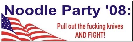
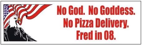
# '''Page 45''' Change the noodle party bumper sticker to this one: http://img.photobucket.com/albums/v711/Marburger/Fred08knifefight.jpg ... these ones might also work elsewhere: http://img.photobucket.com/albums/v711/Marburger/fred08craps.jpg http://img.photobucket.com/albums/v711/Marburger/Fred08pizzadelivery.jpg | # '''Page 45''' Change the noodle party bumper sticker to this one: http://img.photobucket.com/albums/v711/Marburger/Fred08knifefight.jpg ... these ones might also work elsewhere: http://img.photobucket.com/albums/v711/Marburger/fred08craps.jpg http://img.photobucket.com/albums/v711/Marburger/Fred08pizzadelivery.jpg | ||
| Line 133: | Line 135: | ||
# '''Page 64-65''' Spread needs more images | # '''Page 64-65''' Spread needs more images | ||
# '''Page 66''' Change "O:MF" to "Mindfuck" | # '''Page 66''' Change "O:MF" to "Mindfuck" | ||
| + | |||
| + | '''Zarathud Ideas''' | ||
| + | Here's some ideas for what Zarathud is doing as he makes his way through the book. Zarathud... | ||
| + | # Kicks a line, moving it out of alignment | ||
| + | # stands on a line, making it bow or sag in the middle | ||
| + | # has a rope or chain attached to a line, and is dragging it over his shoulder, pulling the paragraph into the margin | ||
| + | # has put tape over a word or two and has written in FNORD. Zarathud stands nearby, holding tape and a pen, admiring his work. | ||
| + | # is surfing on some marginalia | ||
| + | # is driving a crane, and has lifted a phrase right out of the text. The phrase is dangling at the end of the chain, above the paragraph. | ||
| + | # tears out a little part of a page and puts it on the opposite spread. (maybe you can see the page behind it through the "hole" | ||
| + | # has wrinkled up a page. Zarathud looks frustrated and stands at the footer with a lot of crumpled paper around him | ||
| + | # crosses out a byline and writes in "BY ZARATHUD" in childlike lettering | ||
| + | # has a firehat and firehose. The edges of the page appear to be badly burned. | ||
| + | # is rubbing his belly as if he's full. There's a big bite mark missing from the corner of the page. | ||
| + | # page 34-35 has several pictures of screaming people. Zarathud maybe should be holding his hands on his ears, as if he can actually hear the images screaming. | ||
| + | # somewhere I'd really love to see Zarathud putting up a poster on a tree. The pic on the posters is one of 000's nonsensical little doodles, or a portrait of Zarathud or something. | ||
Revision as of 19:33, 22 July 2008
Contents
1st Draft of Etc. Discordia
Let me know what you think of the image quality if you print it out. Also note the printer model, or at least the kind of printer it is — copier, laser, inkjet...
- I'll make a printout of it tomorrow at university, i'll let you know about the model.000 07:24, 16 July 2008 (UTC)
Anything I'm missing?
000, I tried incorporating the ampersand element, but it didn't look right... If you could supply a sketch or a detailed description as to how you were imagining it, then I'll play with it some more. Have you been able to find a CS version of InDesign yet?
- I'll get it ASAP (that is, before thursday evening Amsterdam time, which is the first moment i'll have real time to play with this). my basic idea was just to take the ampersand glyph, make it light grey and place it behind the "Et" in the title. maybe make it real large or something, even half falling off the page. i dunno. i'll play with it.000 07:24, 16 July 2008 (UTC)
I left out a few images that just didn't translate to black and white, but if you're particularly attached to one that's not there, I can give it another whirl.
Also, I haven't incorporated the quotes to be sprinkled throughout, and have been scheming a much busier layout that I'll show you in a few days.
Feedback from 000
- IT LOOKS AWESOME SLICK AS HELL (the frontpage) 000 09:29, 16 July 2008 (UTC)
- Isn't the front page supposed to be in colour? 000 09:29, 16 July 2008 (UTC)
- you forgot the subtitle, "Et Cetera Discordia -- The Party at Limbo Peak". i was thinking, maybe just below the image ... except that ... the crossroads landscape is flat as a pancake LOL :) so that may not make a lot of sense hehehe. or does it perhaps make just enough nonsense to be funny? 000 09:29, 16 July 2008 (UTC)
- Actually, seeing this take form and the general style (the slanted round boxes really give me a sort of 50s feel about it, kind of fitting to the "Bob" imagery) kind of make me want to redo the drawing for the front image, i could also place the crossroads on top of a hill/mountain of course (which wouldnt make sense from a logistic point of view, but does as a metaphor) 000 09:29, 16 July 2008 (UTC)
- I like the idea about including a teaser to entice latent-discordians to pick up and open the book. It should perhaps contain some specific keywords in the teaser. I know, in my pre-discordian days, I'd have opened any book mentioning "Chaos" on the cover, for instance. Maybe it should also mention that it's a collection of short writings? Because, knowing that it's not a long story, but a collection of short bits, would also make it more likely for me to randomly open te book and browse it a bit. 000 09:29, 16 July 2008 (UTC)
- page 12: the BIP card. if it's a card suggesting it might be cut out, maybe not in the slanted rounded box? (even though i really, really like those boxes, so might as well keep it). Further, I think the text [dunno if you made it?] but your life experience, your 'cell,' can be altered drastically is a littlebit creepy/recruiting sounding, like an "improve your life!" ad. either go that way and make it really over the top or tone it down. a bit. How about but your life experience, your 'cell,' might be larger than you think or but your life experience, your 'cell,' can be upgraded with an interstellar spaceport and hi-tech robot sex slaves. 000 09:29, 16 July 2008 (UTC)
- ok, judging from the overall look of the book, i repeat, i love the slanted rounded boxes, but if it's going to be just like this, it's nice and consistent and the weird images can carry the weirdness of the book, but i think it needs at least one more stylistic element to make it interesting. it's kind of overall the same right now. these elements would probably be: Zarathud and short bits/memebombs/marginalia. The marginalia will work nicely, but I'm not entirely sure as of how to fit Zarathud into this clean layout? 000 09:29, 16 July 2008 (UTC)
Net 7/17 re: 000
- THANKS. :D
- I don't know. I can work on a color version, but if someone else makes a cooler one, we could use that instead.
- Maybe you could work in a tubes and truck joke? Subtitle absence has been noted.
- Thanks. I encourage you to print it out for the full effect. Also, I'd be interested in seeing you develop the cover illustration.
- Looks like Cram has addressed this below... Yeah, people like to know what frame of mind to get in when approaching reading materials.
- Yes, I'll try a different frame style, maybe one with scissors and dotted lines. Good call. I didn't make it. We also don't need to include it, editorial discretion, etc, etc.
- I was thinking that if we do end up peppering the book with Zarathud vandalism, that the sketchy style he's drawn in, and the fact that he's messing things up would juxtapose well against a clean, consistent layout. I was thinking of adding some other graphic elements that would help reference the internet and create interest. Netaungrot 23:14, 17 July 2008 (UTC)
Feedback from Cramulus
some of my notes are specifically design/layout, but some are editorial. (I'll take care of those)
- First off, you're to be commended for the awesome job. It's really exciting to see this project come to life like this. It looks more tangible now than I had previously imagined. I hope you've been enjoying making this stuff as much as I have.
- Overall art style: When I saw it on my screen, I didn't quite get it. Now that I'm looking at a printout, it makes perfect sense. The slanted rounded boxes look (to me) like TV screens. This fits with our discussion about having the overall style be a sort of collage - reminiscent of the old PD in that it juxtaposes varying bits of media, but wiht a more modern feel. It reminds me of channel surfing late at night and seeing all this weird stuff. Perfect with the theme of the Strange Times.
- Fonts: I like the fonts. It may be due to low print quality, but in the copy in my hands they seem a bit thin. Could use a slightly bloder font. Overall however, it's very inviting and easy to read.
- Page Size - is this okay for lulu.com? I suspect that the two-pages per page layout we have going right now will confuse our printer.
- Cover: Add subtitle: "The Party at Limbo Peak". The "abstract" at the bottom below the byline, here are some suggestions:—"Explorations of chaos, stupidity, and infinity"—"New iterations of the Discordian fractal"—"Writings from the Discordian Cyberspace Masquerade"
- Inside: Leave room for a copyright page. Syn has generated a few more cover pages, one of which I think would fit well as an inner title page. (the Principia has a few, right?) Insert some room for a Kopyleft page (text to come), and an introduction page (text to come)
- Page 6: change to this image: http://www.mcs.csuhayward.edu/~malek/Surrealism/magritte2.jpg
- Page 9: Perfect placement for the "bob" & Hardy picture.
- Page 11: Introduction to the BIP... this seems very out of context as a second piece. I think the Bare Minimum BIP piece might actually serve as a better intro to the BIP, since the names and sequence of invention are kind of extraneous to the actual idea. Could we replace this piece with something lighter? Maybe the "TAZ has ugly, retarded cousin"? it's a little lighter :-P
- Page 13: Expland first occurances of BIP to "Black Iron Prison". Expand SSOOKN to "Super Secret Order Of Kabbalistic Navigators".
- Page 19: Replace references to America with something more vague. We're talking about Western Civilization.
- Page 21: We've got too much vexati0n / war / america stuff packed right at the beginning. If we ditch this piece, I wouldn't shed a tear. I'm in love with the graphic on page 23 though.
- Choose Your Own Adventure covers: need to photoshop out the author / illustrator names. Add in names of Discordian saints.
- Page 37 Delete Bird Jams. Replace with the piece Dream Jams.
- Page 43 Reminder to self: pick out original posters from POSTERGASM and make into graphics like this one.
- Page 53 Change title to "Divine Madness"
- Page 61 Change title to "Once Upon a Pickle Pickle..."
- Page 66 Remove piece - it's now a part of "Dream Jam".
- Also: The Parable of Steve is in there twice.
Wow, 66 pages and we've still got a lot of material to go.
Net 7/17 re: Cram
- Thanks dude. I couldn't have done it without all the work you guys already put into it. And yes, I have been getting a kick out of it.
- Huzzah!
- Please to note your printer model or kind of printer (laser or inkjet).
- I can export the file to PDF in a number of ways, such as "printer's spreads" where it's all interpolated for double sided printing. What you're looking at is a "reader spread."
- Check. How about "Short Writings and Art from the Discordian Cyberspace Masquerade"
- No problem. We probably should coordinate fonts when this gets a little more fleshed out.
- Ok.
- :D
- I think you're right. Smaller, lighter pieces first, longer pieces in the middle.
- Check.
- Check. CORRECTION! THIS IS NOT POSSIBLE DUE TO THIS LINE: "While we herald the bravery of our men and women in uniform at the many fronts in the War on Terror, we have effectively given our President and the Congress a blank check to spend from our reserves of domestic freedom at their discretion."
- Try "we have effectively given our Leaders a blank check..." - I mean, they a war on terror in the UK too, right? I'm not actually sure how they refer to this debacle. Eh, one or two American references aren't bad. As long as we don't go overboard I don't think it'll be a problem. Cramulus 13:09, 19 July 2008 (UTC)
- Yes. I'll ditch "Support the Troops" for now and reshuffle the image associated with it.
- Ok. Suggestions, pls?
- Check.
- ?
- Check.
- Check.
- Check.
- Lol, good catch. Netaungrot 23:13, 17 July 2008 (UTC)
2nd Draft of Etc. Discordia
I think we're coming into the home stretch ...
Page 19 needs some love. I still haven't worked in all the quotes we have planned and of course there is the title page, table of contents (and the bottom-of-the-page indexing), kopyleft and copyright page, intro, and adding some Discordian Saint names to the Choose UR pwn Adventures, but besides those I think it's almost there.
I have made changes in accordance to the critiques except as noted above. If you compare the text typeface weight, you'll notice it's a tiny bit thicker on this version, as per Cram's suggestion.
No issue is to minute to address at this stage, so if even the smallest thing is bugging you, please get it out into the open ASAP.
I love the FNORD HODGE and PODGE dingbats Syn and other's created. I'm going to massage at least one tube of it into the coarse hairs of the Etc. Discordia's white space.
Are we still all on board for Zarathud shenanigans? All I need is about a dozen ideas and I can start working them in. Note to self: (and anyone who procures InDesign CS in the near future) 1. Copy text. 2. Paste in new text box. 3. Create outlines 4. Change text body element to paper color. 5. Manipulate outlined text for profit !!!! Netaungrot 04:28, 20 July 2008 (UTC)
Cram's Notes 7/22
- Okay, Overall - looking good, still happy with all of this.
- Bold text still seems difficult to distinguish from regular text. This doesn't come up often, but see the Pickle Pickle Parable.
- There are a number of pieces which still aren't included. They include:
- Hearts & Minds
- the Shrapnel Theme stuff (recently updated by RWHN)
- Liber Fru Fru (let's just grab the internet bit which has been retyped)
- OMGASM description
- Stupid Content
- Finished Cutups (other than Dream Jam)
- Zen Koans
- Myspace Monkeys
- A lot of the Marginalia
- Could you make more of the marginalia look handwritten, or set at an odd angle? I'd love to see it look like it had been scribbled on, sort of like the PD. So far most of the marginalia has been set upside down, which is fine, but MOAR! Don't be afraid to break some style rules with the marginalia, it should look cutup, collage, out of place, extraneous. Like some kid got ahold of the book and wrote notes in the margins before it got sent to the printer.
Specific page commentary
- Front Cover: 000's piece is really colorful. I also think (and I may be wrong here), that we can get a color cover on this thing. If so, we should really blow up that image. And being the cover, let's ditch the computerized vertical-line effect thing on it.
- TOC: Magritte painting should accompany The Strange Times, not hte TOC. The TOC text needs to be updated into an actual Table of Contents. Instead of the Magritte, let's put in one of the ads for the party, in the propaganda thread. Or even better: that sexy image that 000 shopped up which was the forum header image. (you know, the Mount Olympus Water Park one)
- Page 3 Needs byline "by Professor Cramulus"
- Page 5 What happened to the laurel & hardy "bob" pic?
- Page 6 I love the font for the CHAOS section. Can we get some more of the marginalia in that font? Looks like a typewriter.
- Page 11 I think we should ditch this piece. It's too bad, but it's not really relevant. I talked to RWHN about it, and he's cool with it.
- Page 14 Good pairing of image with text. This spread (p14-15) needs some text though, would be a good place for a koan or some more marginalia.
- Page 16 Being the first Cutup/Zarathud piece, we need some serious zarathud here. I wonder if there's a way to graphically demonstrate that he's taken two pieces and cut them up? 000?
- Page 19 Switch the image here (whatever it ends up being) with the image on page 16. I'll dig around some more for some wacky MS Paint collage
- Page 20 Either the quote or the credit should be in ital. Not sure which matches our style better.
- Page 22 Good pairing of image and text
- Page 23 Needs a pic of Enrico. Try this one: http://homepage.ntlworld.com/porlstephenson/News/Gaddafi_Tikaram.jpg or this one: http://www.coxandforkum.com/archives/CARI.Gaddafi.gif
- Page 24-25 This spread has very little text on it. Needs more marginalia, koan, whatever
- Page 31 needs attribution "By Professor Cramulus". Also: I've decided this piece works better with "O:MF" written as "Mindfuck". So it should be "Go Mindfuck Yourself" at the beginning and in the ending bit.
- Page 39 needs attribution "By Professor Cramulus"
- Page 43 ...It might be cute to draw a correlary between the Etc. Discordia and the PD. Being that this is the only game in the whole book, (which I find odd, personally) this might be a good place to do it. http://principiadiscordia.com/book/images/Sink.gif - that image is from the PD's game SINK... maybe add it here?
- Page 45 The weird text in the Channeled Messages "Y'H-SH'RP-E-DU-DUDU-DEDA-DADA" might work better in a different font.
- Page 45 Change the noodle party bumper sticker to this one: http://img.photobucket.com/albums/v711/Marburger/Fred08knifefight.jpg ... these ones might also work elsewhere: http://img.photobucket.com/albums/v711/Marburger/fred08craps.jpg http://img.photobucket.com/albums/v711/Marburger/Fred08pizzadelivery.jpg
- Page 63 missing some italics. Should read "I do it for me. You're doing it like me." Also, the last line "Think For Yourself, Shmuck!" should be in italics.
- Page 64-65 Spread needs more images
- Page 66 Change "O:MF" to "Mindfuck"
Zarathud Ideas Here's some ideas for what Zarathud is doing as he makes his way through the book. Zarathud...
- Kicks a line, moving it out of alignment
- stands on a line, making it bow or sag in the middle
- has a rope or chain attached to a line, and is dragging it over his shoulder, pulling the paragraph into the margin
- has put tape over a word or two and has written in FNORD. Zarathud stands nearby, holding tape and a pen, admiring his work.
- is surfing on some marginalia
- is driving a crane, and has lifted a phrase right out of the text. The phrase is dangling at the end of the chain, above the paragraph.
- tears out a little part of a page and puts it on the opposite spread. (maybe you can see the page behind it through the "hole"
- has wrinkled up a page. Zarathud looks frustrated and stands at the footer with a lot of crumpled paper around him
- crosses out a byline and writes in "BY ZARATHUD" in childlike lettering
- has a firehat and firehose. The edges of the page appear to be badly burned.
- is rubbing his belly as if he's full. There's a big bite mark missing from the corner of the page.
- page 34-35 has several pictures of screaming people. Zarathud maybe should be holding his hands on his ears, as if he can actually hear the images screaming.
- somewhere I'd really love to see Zarathud putting up a poster on a tree. The pic on the posters is one of 000's nonsensical little doodles, or a portrait of Zarathud or something.